About Me
Friday, 30 March 2012
Monday, 26 March 2012
5. How did you attract or address your audience?

My audience for my magazine ranges from older teenagers to young adults, mainly for students in A’ level or if they go university as it will keep them up to date with all the trends and new music artists as they might not have much time with the work they get so it will attract them to buy it. I want to attract both males and females I did this by taking a picture of a two lads called Rizzle Kicks and taking their look on to two girls the same age as my audience so it will get the attention from the girls too. This will appeal from what she’s wearing or how she’s style with her hair make up and pose on the page. You'll find females are shown the most in both male and female magazines so my magazine will show both genders as well as the clothing they wear which will connect well with the audience and draw males attention. The cover uses neutral colours that will interest both males and females when coming to buy the magazine and uses simple text on the page not covering the picture to much so you can see all the main features that are tasteful which will give a small bit of information that’s based on female and males artists that are new in town targeting the audience that enjoy new music using a few main genres to make my magazine attract the right audience. I have chosen a few new British artists that people have heard of as there more likely to get to see them perform live also including a lot of new names never seen before giving my audience more of a variety in the sort of genre they like as each artist might have a different style of music. I have also put the price and data on the cover of the magazine letting readers know when they got it and being able to tell when the next ones out and which ones they might not have. Next to the price I have put ‘volume one’ showing there will be many more which will all cost the same to buy the magazine each time which will become a collection that people might want to collect if they enjoy the information being given to them.

The contents page is designed for my audience because they will be able to understand the words and sentence structure I’m going to use as it will fit the genre of music i have chosen and will be able to relate to the brief description i have used on the page featuring certain parts. The language is formal so it will be easy to read and understand when my audience are reading it. I used these photos of the band as they will attract the audience as ill be talking about this band in the article as they are in the same age rang as the target market I’m looking at and they are upcoming, hard working artists that will inspirer the audience and get them interested. All the features give my audience an insight to what's in the magazine and will draw my market in even more if they enjoy what they read. The article that's included in my magazine lets the audience get up and personal in there life to see what its like to be living the dream, giving them a chance to be closer to the artist. By giving heading for the most important parts of the magazine makes it easy for the readers to go to the page they want to read about like festivals so they can see what number the bit of information they want to read about's on and go straight to it.
 The interview language is appropriate as its set in an interview style which is effective on the readers as they get to looking it the artists life and how they talk. I think the picture i have chosen for my double page spread would appeal to my audience from the page iv used and the pose they are standing in as they aren't looking into the camera making them look older and less interested in what's going on, which will draw the audience in as they are the same age as the artists and can relate to them. The cover line on my double spread page reads ‘no matter what you do, they'll be critics' this will relate very well with the audience as this kind of information is always shown in magazines trying to make the artist feel bad and it relates to the audiences feelings too, this makes the audience want to buy it as it grabs there attention straight away and makes them interested how the artist dealt with the bumps in the road and got to where they are now. The article talks about everything they have done to get to the stage there at, all the ups and downs which might feel like they have something in common with the artist and respect their view points. The article is mainly about the bands music and why they choice the genre of music they did which would in-ties my readers even more as they would want to read about music and also the kind of style they might wear out for concerts. I think I’ve done a very good job of getting my audiences attention and addressing them in the right way. I’ve done this by talking to my models and reading through the artists profile to be able to get all the information that connects them to my audience in my magazine. The whole magazine is based on what my artist likes and what they would look for to buy in a magazine for their style of music which made it easier to get it right for my audience.
 The interview language is appropriate as its set in an interview style which is effective on the readers as they get to looking it the artists life and how they talk. I think the picture i have chosen for my double page spread would appeal to my audience from the page iv used and the pose they are standing in as they aren't looking into the camera making them look older and less interested in what's going on, which will draw the audience in as they are the same age as the artists and can relate to them. The cover line on my double spread page reads ‘no matter what you do, they'll be critics' this will relate very well with the audience as this kind of information is always shown in magazines trying to make the artist feel bad and it relates to the audiences feelings too, this makes the audience want to buy it as it grabs there attention straight away and makes them interested how the artist dealt with the bumps in the road and got to where they are now. The article talks about everything they have done to get to the stage there at, all the ups and downs which might feel like they have something in common with the artist and respect their view points. The article is mainly about the bands music and why they choice the genre of music they did which would in-ties my readers even more as they would want to read about music and also the kind of style they might wear out for concerts. I think I’ve done a very good job of getting my audiences attention and addressing them in the right way. I’ve done this by talking to my models and reading through the artists profile to be able to get all the information that connects them to my audience in my magazine. The whole magazine is based on what my artist likes and what they would look for to buy in a magazine for their style of music which made it easier to get it right for my audience.
Thursday, 22 March 2012
3.What kind of media institution might distribute your media product and why?
The best suited institution for my magazine would be IPC media as they distributed NME magazine which is close to the social group that I’m targeting at for my magazine. I think it could be sold for both genders male and female which could connect in both divisions of the company. The institution IPC is a large business that could get my magazine a wide range of target audience when coming to selling my magazine; this could be a big advantage for my magazine. There is no market in the magazines institution at the moment that sells magazine for both genders and about new upcoming artists that could interest many different people. The experience from the NME could give the magazine something new to work with and make my magazine successful when putting it on to the market as they have good knowledge on how to sell new magazines. I can distribute my magazine in a few different methods like in shops on the magazine stands also publishing my magazine online so the readers can see more about the magazine every week with updated information which makes it more available to readers, this works well as the target audience I’m going for will be able to use this technology. There are three distribution circulations that I could use but I would pick the paid circulation as this is when the magazine is sold to readers for a price, either on a per-issue basis or by subscription, where an annual fee is paid and issues are sent by mail to readers which the NME do as well as many other magazines. This would benefit everyone in the long run as my target audience would want to buy more but if I went for a free circulation this would have a different effect on my magazine as people wouldn’t need to pay for it so it would be opened to everyone to read as they would just pick it up which wouldn’t make it exclusive as people wont want to read it, so doing it the paid way it would make the magazine worth spending time to read it. However the controlled circulation is to far in the other direction for the target market I’m going for (teenagers) as they wouldn’t want to meet the requirements of a magazine as this would be to much effort for them to access a magazine when they can do it easily from shops. When looking at other magazines and the type of magazine IPC media is I would sell my magazines every week so people can buy them and find new interesting things out every week which can be cheaper as well if you subscribe for a long period of time.
Wednesday, 21 March 2012
Wednesday, 14 March 2012


Tuesday, 28 February 2012


Fonts
These are a few websites iv been on to get the fonts i want that work well with the style of magazine im going for. The fonts iv chosen stand out and get the eye of the reader, there different to other magazines iv seen and will hopefully pull in a bigger audience.
http://www.dafont.com/embossing-tape.font
http://www.myfonts.com/fonts/coniglio/carbon14/
http://www.dafont.com/embossing-tape.font
http://www.myfonts.com/fonts/coniglio/carbon14/
Wednesday, 22 February 2012
Feedback On Magazine
The feedback i got was i need to change the layout of my contents page, use different kinds of fonts that stand out and get the readers attention as well as using differnt colours on the page as at the moment it looks very simple and boring. Also she said i need to think about the places i take my pictures for my magazine and the clothing im going to use as i need more than one outfit for my models, facial expressions are another thing i really need to think about as their faces need to be blank but need to work on how i can best show it in the faces. She said i need to use a bigger bolder font on the double spread so the heading stands out, using a quote or somethign different to my magazines name, also editing my picture on the double spread to make it blend in better and stand out by using brighter colours. The font for my bands name on the front cover needs to be in a different font and colour to stand out and changing my lay out as its really plain at the moment and it needs to be eye catching for the reader which it isnt doing at the moment she said.
- Take more pictures in different places
- Use mutlituple clothing for the models
- Use more colour on all pages
- Change the font for the bands name
- Changed the layout of contents, look more messy and over the place
- Change double spread heading to a quote
- Make text box's all the same size (might need to delete some information)
- edit photos
Monday, 20 February 2012


Friday, 17 February 2012
Evaluation Question
1. In what ways does your media product use, develop or challenge forms and conventions of real media products?
My magazine uses the F and Z model on each page which is used in every magazine we buy these days, I also looked at the types of fonts and colours they use in magazines and used a few on mine like a white background with black text on it which stands out to the readers. I use a lot of photos of the band im using so the readers can see what there style of fashion is and how simple they look but it works well with the audience there going for. On the double spread page we use three columns to make the article look neat and easy for the readers to read with a whole page of a picture of the band so it gives the reader more idea who there reading about. The contents page numbers out each page and gives you a bit of information about what your going to read about so you can see if you like the magazine before you buy it. The front cover uses a big blown up picture showing the band and there main features as its just there face and shoulders you see with bold lettering for there name and the title of the magazine which would fit in with the media market as mainly magazines are set out like this just a few things are different to get more of an audience.
2. How does your media product represent particular social groups?
My product mainly represents teenagers who want to know about the new types of bands and singers coming into the industry at the minute as there is always new up coming singers that people don't know about but with this magazine it will give you up dates on what's new in music and will target teens who are into new different sounds. It will open up many peoples eyes to how you start off becoming a singer and will inspire the teenagers out there wanting to get into the music industry which will give them tips on how to do so. Also the type of clothing is geeky but stylish and only suits certain people which will get the eye of this social group we're going for and making them more interested in the style were approaching.
3. What kind of media institution might distribute your media product and why?
The kind of magazine I was going for was the NME style magazine as it is bold and uses the kind of music genre im going for in my magazine. Also DAZED magazine inspired me to as it uses neutral colours that im going for in my magazine as it works best with the models im using. The way they layout their pages are how I wanted mine and inspired me to mix it up a bit and make my magazine plain so people buy it for what's inside but also catches your eye as its different to other magazines in the market by using neutral colours but making some brighter than others on key features so it stands out on the page, like the two magazines iv chosen which inspire me to make mine.
4. Who would be the audience for your media product?
My product mainly represents teenagers from the age of 14-18 as its a simple design on the front cover and uses the kind of language teens would use which relates with their life style also the kind of clothing iv used on my models represents teenagers too and in the magazine I talk about fashion as this is one of the biggest subjects teenagers are into and look up to artists for their style of clothing. Also the type of magazine it is would interest all the age group im going for as we like to stay up to date on who's new in the music industry and who's good or not so good as we don't like to be left out on gossip, which teenagers are all about.
5. How did you attract/address your audience?
I attracted my audience by using neutral colours also making part bright which will stand out and catch my audiences eyes also I used bold black text for headings and master heads so you know what your reading about at the time. The band im using wear the kind of style my audience would wear and also would bring new and different audiences as it has a bit of a unique style to it. I addressed my audience by using the type of language they use and understand, not using any difficult big words they might not understand. In the article and through the magazine I use quotes from the band so the audiences feel like they know the band and get to know about what they've done to get to the stage there out which will interest the teenagers.
6. What have you learnt about technologies from the process of constructing this product?
The photo shop I went on to make my magazine cover, contents and double spread pages was hard as iv only used it a few times before and to make the picture the style and colour you want it by changing the back ground colour can be hard. Putting fonts onto the magazine wasn't hard but trying to find the style font you wanted and that would go well with the magazine you were going for was hard and took time, also to make it to the size I wanted so it would cover the top of the page. It a very creative technologies and can make your magazine look very unique and different to others in my class but you have to spend a lot of time working on it to get it to the best of you abilities as it can be tricky to use. It can divide the pages into grids which makes it easier to layout the page as it gives you guide lines on where to go and you can count the space your using for text boxes and then do it again to make it all equal and look right.
7. Looking back at your preliminary task, what do you feel you have learnt in the progression from it to the full product?
A lot of my ideas have change and became stronger for the type of magazine im doing, also my article was easy to do as I knew the band I was going to talk about and the type of genre there music was which fitted in with my magazine. Iv had to changed a few things like the pictures im doing to get the best finishing effect on my models so it works well with them and will still fit in with the front cover I want to do. By doing my draft magazine I can see the thing I still want to change and certain bits I think work well with the style im going for, also hearing back from the teachers gives me more ideas on what to do and lets me know if they understand what kind of magazine im going for and if there not sure I can change parts to make sure they understand completely what style of music my magazine is. Id do this by changing the layout and pictures also colours as they describe everything about my magazine.
Wednesday, 1 February 2012
Shots
These are a few pictures iv taken that i might use for my background on my front cover behind my models and the other kind of backgrounds ill use for my double page spread and smaller pictures in my article and contents page so the readers get more of a feel of the style my band is as the pictures descride everything about a person and there music.
 I was thinking of using this as my front cover background as its simple and my models would stand out on the wall but im not completely sure.


 Here this picture is set in the garage which i thought it gave a new band feeling to it but the wall isnt plain as it has objects on there i could take off but wouldnt completey work with the style im going for, but defently and plain wall will be used for my front cover. I was thinking my room walls which ill show on here later.
 I was thinking of using this as my front cover background as its simple and my models would stand out on the wall but im not completely sure.
I was thinking about using this picture as my background to the double page spread i was wanting to do as its a more detialed background and shows a bit more to the models personality's.

This is the same as the other picture above id use it for the double page spread but its just set in a differnt place and has featuers in the background like the house's i dont want, as they arent part of my design for the magazine.
 Here this picture is set in the garage which i thought it gave a new band feeling to it but the wall isnt plain as it has objects on there i could take off but wouldnt completey work with the style im going for, but defently and plain wall will be used for my front cover. I was thinking my room walls which ill show on here later.
Artist Profile
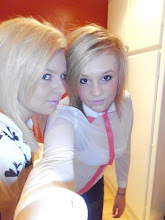
My artists are two girls at the age of twenty becoming part of the music industry. They have known each other for many years and have always had a dream of becoming famous singers, writing there owns songs and lyrics showing the world what they can do. They were both born in leicester and went to the same schools when they were younger. They used to always play on instrument toys as kids and made there own tunes and performed it to there parents, there parents could tell they were going to become big one day. Daisy is tall with dirty blonde hair and wears simple colours of clothing, she wears vans or nike's also knitted jumpers of the geek look that is very popular at the moment. Emma has the same style of clothing but she has long blonde hair and is a little bit shorter than daisy which makes daisy stand out as she is the lead singer. Daisy raps and emma sings as well as playing the guitar which she learned when she was a young child.


These are the picture of my artists daisy is on the right hand side and emmas on the left hand side. The profile describes there style and looks in the pictures but they wont be wearing those clothes for my photos as theyll look more geek sheek.
Mock Article
Stereotypical music is not a place to search for hidden depths. It’s a mixture of pop and hip hop incorporating the fun elements of the old school hip-hop era circa 1988-92. Stereotypical was founded in 1999 in their miniature form they would play together round the lead singer’s auntie's house. Three years later walking through a fog of cigarettes with bright lights flashing, the adolescents meet again and started to create a cover track of one of lily allens songs. They soon realised how pleasantly there styles of music went together and created the band name stereotypical this was the start of something fresh and simplistic.
Rapping and singing mixed together, there styles of music so different but what they wanted to achieve in life was so similar and this is what made the band so strong and determined to make it big in the industry. At their first concert at the ‘mac lock garage’ the girls suited up and geared up for their first show. The noise grew louder and louder from the sound of alcohol influenced crowd which weighed the pressure on the shoulders of the two average height girls, one shorter than the other. First on stage is the front lady Daisy long legged, dirty blonde with a stylish head band, hair on end, following her comes Emma long blonde hair so thin it flows in the wind. Beams of bright lights and smoke flooding the stage making the girls faces glow with excitement. “Our first performance and I’m confident will get the crowd going”.
As they started to sing the lights pin pointed them, they had no where to run this was it what they had worked for all eyes on them. A few people stood around at the sides of the floor holding on to each other out of breathe as the theatre was so small for the thousands of body’s jumping around people slowly falling to the floor begging for water of the security guards. The girl’s faces drop thinking it was their music generating all this aggravation, you could see in some of the audience’s eyes they weren’t sure about the style of genre the girls had picked but the mob was on such a high from the fumes they didn’t care, a successful night in the end for the band Stereotypical. “We’re different to other people and we have been waiting for this chance to perform, it’s our dream”. Progress had been made and they got their chance to let people listen to their music and see the reactions on there faces.
They got a recording contract from this and have started working on their first album called ‘Progress’ that will be sold in all high selling CD shops. This name worked well for their first album as this is how they felt when they went through the stages to get to where they are now. The front cover of their album is on a simple neutral colour background showing the clothes there wearing, a full view. There is also other picture shown in the album page of different views of their style and fashion on how they look to give the fans more of an idea of their style and appearance. Their first song was realised on the 14th of January and was called ‘Heat Wave’, they used this name as the song describes there effort creating there sound over the years and it all paid off in the end. They write their own songs as they want there work to be all them self’s and get inspiration from everyday life. They have worked so far with the artists Gorillaz, Lily Allen, and Arctic Monkeys as their music has inspired them in the past and like to hear what other well-known artist think of their style of music to give them inputs on the sound and lyrics they use.
Their next step this year is to work with big names in the industry that inspirer them the most and to spend lots of their time in the studio working on the new style they want on their next album as they want their fans to keep buying their music. By doing this the songs will have to be different and not sound to similar which a lot of artists find it hard to do but their willing to give up everything to get the best sound and look to catch the eye of the public and try to get a bigger audience. Their planning on doing a tour around the UK and see how well they do, then moving on to places around the world where they’ll be a larger population of teens that will enjoy their style of music, giving an unique vibe about them to catch the ears and eyes of the public and enforce a fan base behind them to make them a strong working band achieving all the visions they have of being part of a band and the life they want with it. They are very home loving girls and spend a lot of time with their family and they are part of the group of people that make sure their performances and albums go right and have no troubles on stage, this is the beginning of the new band Stereotypical.
Monday, 30 January 2012
Double Page Spread
Here i am showing some double spread pages i have looked at that have gave me ideas of how to layout my double spread page in my magazine. I already have a few ideas that i have shown on my mock drawings but i have looked at music magazines and all different types to see how they lay there articles out as i am having a bit of trouble on how to do my article and how to make it look attractive to the readers.


I like this double page spread because it show a whole page of the band the magazine is talking about so the audience know who there reading about and what they look like and the style they are as they use dark colours and whites to make the background of themselves stand out. On the first double page spread it explains where the picture is taken and it gives you and inside that the article your going to read is about one fo there performance's. On the right hand page is the artile about the band and there tour, it is shown in three neat columns which is used a lot and an extra picture at the bottom of the page so its not all information and gives the reader more of a feel of the performance they did. They use a bold title and red writing for a quote from the band which stands out.
This double page spread is the same as the first one with the first page with a pictuer to get the readers attention when they turn the page but it has a bit of infomation on it to draw the readers to the main details of the magazine as it say 'need to know'. The second page they split it in half using a blue line down the middle showing the article about the teenagers on one side using a bold black font to catch the readers attention, also using quotes and drawings to give the readers more of an in side to the magazine. On the other half of the page they use a black background with white writing on it which is the opposite to the other information on the page. They show different bands and give you a bit of detail on them and can find more out about them in teh magazine.
They show the featuring artist on the left hand side page using up a full page to attract the readers attention. The article uses bold big letters for the title to crab the readers attention and gives you a idea of what the atricles about. They use four columns and show a quote from the band leader about what she thinks, they use black on white like a lot of magazines but the font used on the right hand page works well with the featured artist on the left hand side as her make up matches the font colour.
Every double page spread iv looked at in magazines all have a picture on the first page covering the whole of the page as it shows the readers who the articles going to be about, then use big bold letters for the title and use quotes as well as a few pictures so the readers have more of an in side to the artist there reading about. The colours all work well with the theme of the magazine and make the picture stand out. This inspires me to use a picture on one page and using colmuns for the article to make it look neat and easy to read. Ill keep the colour of the text to the theme im going for so it will all work together.
Friday, 27 January 2012
Girl artists
Im going for two females on the front cover of my magazine so i need to look into the side of women hip-hop artist that relate to the style and genre im doing, iv looked at a few videos on youtube and iv found two that go well with the style of the artists im wanting to use in my magazine project. I need an artist that is very simliar to rizzle kicks and has the style of music and clothing as im using woment but using the male dress sense but in girls wear so making the magazine for both girls and boys.
The ting tings are a band and the singer of the band is a women their style of music is hip-hop like the other two artists i have chosen and the style of their videos are very simple on a white background or one colour they wear similiar clothing to rizzle kicks as they dont try hard to look good there music brings them there fans not what they look like and its the kind of style im going for.
Lady Sovereign is another hip-hop artist that goes with the style im going for she wears air max's that go with the style of clothing im going for. She also sings and raps which gives her more of a wider range of people that will like her as she can change how she sings. She a soul artist which im not doing im using two people which is shown in a band but her style will go with my magazine as she uses white and black colours and neutral colours as well which is part of my theme in my magazine.
I dont know this artist very well but the settings she uses in the video are the kind of looks im going for in my magazine. The colours and places the backgrounds are set are the type of style i want on my front cover and link back to my other artists. The sound of this artist relates to the artists iv chosen before but it has its own vibe that doesnt relate to the style i want for my magazine. The make up and clothing she wears isnt what i want on my magazine, which is different to my style of artists.
Mock Versions Of Magazine
Here are my three front covers, three contents and three double page spreads which all have different ideas of how i want my magazine to look. I have annotated each picture with how i want the fonts and text to look and what colour i want them, so they fit in with the background of my magazine and theme colours. I spoken about how i want my models to look and the kind of article language ill use on my double page spread.


Thursday, 26 January 2012
Backgrounds
These are a few backgrounds i have found on the internet that would go with the style i want behind my models through out my magazine being shown on each page.
 I love the look of this picture as it goes with the idea i have produced on one of my mock front covers. I wanted to show my models on a bench also against a wall and here they have both this works well with the style of magazine im doing as it is simple and the colours are neutral which will make it easier to take a picture with the models im using for my magazine.
 This is a simple brick wall which i was thinking of using on my cover and having my models standing in front of it but it looks a bit boring as there isnt much on the background so i might re think about this kind of style for my magazine cover as i want it to best describe my band style and id like something more to work with that i can change around till i get it right.
 I love the tree in this picture i was wanting to use a my models in front of a tree to give a different look to them using the neutral colours im using through out my magazine. I was wanting to use this picture on the double spread page so it would be shown on one page letting you see the really detail and id make the models stand out more by making the colour on them brighter to the background and see there facial expressions which is a completely different idea from my front cover picture. I want to use different settings for each picture i use in my magazine so it has more veriate.
Fedback
I think my pitch went well as everyone understood the style i was going for as i didnt need to answer to many questions, I approached my pitch with a calm, controlling voice so everyone could hear me and stood up straight as well so the camera could see me also pointing at things on the pitch so the class knew what i was talking about to make it clear for everyone. I got questions like 'what style of music is your magazine' 'what colours are you using' 'what is your target audience' and I knew excatly what I wanted for each of the questions. This all makes me confiedent to make my magazine, as i think i know what kind of magazine im wanting to do and what im wanting to make it look like as well as the people im using on my cover. I researched about my artists style of music and how they got into industry also the kind of people like them in the market, i knew quite a lot already about them as im a big fan of the artists i pick which gives me an inside to there style of music.

Tuesday, 24 January 2012
Pitch's
My favourite pitch was vish's as the artists he used are related to each other as they were all rap and have life storys that are brought up a lot on tv and in magazines. I personaly love the artists he has chosen to do and i like the colours he decided to go with as they go very well with the artists he has used and will stand out on his magazine. His pitch was very easy to understand and i understood what kind of magazine he wanted to do straight away, the only thing i wasnt certein on was what kind of person he will be using on his front cover and how it will target his audience. The magazines he represented his with all worked together and i could see what style of magazine he wanted to do as well as the style of clothing hell be using on his model but he wasnt completely sure what clothing to use, he chose a male for the cover as the type of music he has chosen suits the male industry of single male singers with a story behind there reason to singing which hell have to try and show in his magazine.
 Eminem was one of the artist he used in his pitch and works well with the magazine style he is going for. A lot of people know about eminem and his past story of growing up and becoming a sing as he made a film called '8 miles' which gave you a massive look into the inside of his life and inspirers his fans.
Monday, 23 January 2012
Audience Research

Friday, 20 January 2012
Language
The type of language ill use for my magazine is simple hip-hop style that will relate to the readers and get there attention. The type of magazine that already uses this type of language is the NME magazines which is most like the style of magazine i want to do. The information is easy for readers to read and understand, they also give facts and interviews about the artist which ill be doing as well on my double spread page. Ill use eye catching words for my main information which will be in bold capital letters to, ill also use quote's from artists and what readers think. Urban and suburban communities are seen throughout the world and this forms bands and types of music styles and the way language in magazines are created.
 The language on the front cover of this magazine is very rude and not very suitable for young childrens eyes, but they have set an audience for there magazine and works well with the people there trying to get tp read there magazine. This language stands out to me as its a bit rebiliers and has a stronge crab on readers as they understand what its going on about.
Thursday, 19 January 2012
Audience Profile


Alex is another model for my magazine as she also has a style I like and will work with the magazine im doing. She shops mainly at top shop and likes top man to as she likes the boys jumpers from there which girls wear a lot. In this picture I like the top she's wear as its got a neutral picture on a black background which stands out really well as well it has writing at the top of the top and I like the font used. Becky's and Alex's styles are quite similar as they shop at the same places and like the sort of clothing but they work better in different clothes so ill make sure they wear the right colours with there complexion and the lightness looks right as well.
Moodboard

Fonts
Dreamers
Dreamers
Dreamers
Dreamers
Dreamers
Dreamers
Dreamers
Dreamers
Dreamers
Dreamers
Dreamers
Here are a few fonts that i found that i like the look of and think they will work well with my design im doing for my magazine. Some fonts are bigger than other which stand out more to me, i dont like neat fonts as they look boring and they are the kind of fonts you use for the main text on the page were they shown in columns. The title of my magazine has to be able to stand out to the reader and crab peoples attention so i think going for a big font works well and one were the letters jump out at you as there not straight on the page which wont work with my style either. I want to link my title font with the artist to so its shows im using inspirartion on my magazine from them and the teacher can understand what style of mucis im going for by looking at the title as well.
Colour Palettes

Wednesday, 18 January 2012
Other Artists
These are a few videos of the type of music style im doing and what they wear which ill be using in my magazine. They are shown to wear plain tops with hoddies and the videos are very simple no special effects are really used. The artists iv chosen in these videos all sing and rap which shows there multi talented and it works well with the sort of vioce they have and also fits in with there fashion statments they make. There music is about every day life and they show this in there videos by setting the scene and some times using there imagenation in there own vidoes which can relate to the audience that watch and listen them.
Magazine name
Dreamers
Trouble makers
The city
This
Home wrecker
Prophet
Drunk
This is a brainstorm of a few ideas I have for the name of my magazine. I’ve used the kind of words that best describe the music I’m doing and trying to represent my artists that I’ve chosen. These are songs off of Rizzle Kicks and Ed Sheerans album that stand out to me and will best fit my magazine style. My favourites from the list are ‘DREAMERS’ which reminds me that you can dream and one day things just fall into place like its meant to be which reminds me of how Rizzle Kicks became famous and ‘THE CITY’ reminds me how Ed Sheeran lived in London and performed a lot so people would here his music and how he gave up everything to live in the city on a sofa. I’m not quite sure yet which one I’m going to use.
Monday, 16 January 2012
Clothing
These are a few clothes i have seen that remind me of the artists i have talked about and the kind of clothing ill be using in my magazine. They are all quite similar and are very simple, as well as a big part of fashion at the moment for boys and girls. Ill be using girls as my models and they will be wearing similar things to this clothing line iv chose. A lot of girls wear boys clothes these days as it works well on them and genders in clothing are merging together, shown in what people wear every day. The colours all blend as these are the most popular types of colour woren by male and females but ill be using brighter colours that will stand out more but will be nutrial colours that will fit in with the theme im doing and also work well with the place im setting up my photo shot.


My Response On The Teachers Comments
I have used your advice about the magazine NME and it has some very good images of the sort of magazine im wanting to do as well as the type of music they play. Iv also used a few others you told me to look at but i think NME works best with the music magazine im doing, which ill show on my anaylsis of the magazines im doing now.
The easy parts of achieving the look im going for is that the clothes the artists are wearing that iv shown you are the clothes i have in my own wardrobe and they work well with the people im using on the cover as they also wear this sort of clothes. The difficult part is getting the right lighting and colour to go with the style i want and making sure my models work well with the theme of my magazine, might have to change a few colours around and use a few brighter and colourful colours.
The easy parts of achieving the look im going for is that the clothes the artists are wearing that iv shown you are the clothes i have in my own wardrobe and they work well with the people im using on the cover as they also wear this sort of clothes. The difficult part is getting the right lighting and colour to go with the style i want and making sure my models work well with the theme of my magazine, might have to change a few colours around and use a few brighter and colourful colours.
Thursday, 12 January 2012
Image & Fashion
These are a few fashion images i like off of 'look book' which link to the artists i have chosen and the sort of image im wanting on my magazine cover. These clothes are simple and a new geek cheque that is very popular in many shops and a big seller to teenagers.


I like the image of the boy he looks stylish but in a simple and geeky kind way which will get a big audience. The colours used are nutrial and work well with the setting he is in as well as the clothes colours blending it to the background and you work out what time of year it is, Aurtum. The girl is also wearing the same style as the lad and it applies to me as well as other teenagers, she is shown in a stereo typical london setting which works with the clothes she's wearing as there smark but casual and work with the setting she's been put in. Many artist are wearing this style which inspirers other people to wear it.


This influences me by letting me know the colours that work well with the person I use and is shot with a theme that connects it all together.
Subscribe to:
Posts (Atom)