Monday, 30 January 2012

Double Page Spread

Here i am showing some double spread pages i have looked at that have gave me ideas of how to layout my double spread page in my magazine. I already have a few ideas that i have shown on my mock drawings but i have looked at music magazines and all different types to see how they lay there articles out as i am having a bit of trouble on how to do my article and how to make it look attractive to the readers.
I like this double page spread because it show a whole page of the band the magazine is talking about so the audience know who there reading about and what they look like and the style they are as they use dark colours and whites to make the background of themselves stand out. On the first double page spread it explains where the picture is taken and it gives you and inside that the article your going to read is about one fo there performance's. On the right hand page is the artile about the band and there tour, it is shown in three neat columns which is used a lot and an extra picture at the bottom of the page so its not all information and gives the reader more of a feel of the performance they did. They use a bold title and red writing for a quote from the band which stands out.
This double page spread is the same as the first one with the first page with a pictuer to get the readers attention when they turn the page but it has a bit of infomation on it to draw the readers to the main details of the magazine as it say 'need to know'. The second page they split it in half  using a blue line down the middle showing the article about the teenagers on one side using a bold black font to catch the readers attention, also using quotes and drawings to give the readers more of an in side to the magazine. On the other half of the page they use a black background with white writing on it which is the opposite to the other information on the page. They show different bands and give you a bit of detail on them and can find more out about them in teh magazine.
They show the featuring artist on the left hand side page using up a full page to attract the readers attention. The article uses bold big letters for the title to crab the readers attention and gives you a idea of what the atricles about. They use four columns and show a quote from the band leader about what she thinks, they use black on white like a lot of magazines but the font used on the right hand page works well with the featured artist on the left hand side as her make up matches the font colour.

Every double page spread iv looked at in magazines all have a picture on the first page covering the whole of the page as it shows the readers who the articles going to be about, then use big bold letters for the title and use quotes as well as a few pictures so the readers have more of an in side to the artist there reading about. The colours all work well with the theme of the magazine and make the picture stand out. This inspires me to use a picture on one page and using colmuns for the article to make it look neat and easy to read. Ill keep the colour of the text to the theme im going for so it will all work together.
Friday, 27 January 2012

Girl artists

Im going for two females on the front cover of my magazine so i need to look into the side of women hip-hop artist that relate to the style and genre im doing, iv looked at a few videos on youtube and iv found two that go well with the style of the artists im wanting to use in my magazine project. I need an artist that is very simliar to rizzle kicks and has the style of music and clothing as im using woment but using the male dress sense but in girls wear so making the magazine for both girls and boys.


The ting tings are a band and the singer of the band is a women their style of music is hip-hop like the other two artists i have chosen and the style of their videos are very simple on a white background or one colour they wear similiar clothing to rizzle kicks as they dont try hard to look good there music brings them there fans not what they look like and its the kind of style im going for.


Lady Sovereign is another hip-hop artist that goes with the style im going for she wears air max's that go with the style of clothing im going for. She also sings and raps which gives her more of a wider range of people that  will like her as she can change how she sings. She a soul artist which im not doing im using two people which is shown in a band but her style will go with my magazine as she uses white and black colours and neutral colours as well which is part of my theme in my magazine.


I dont know this artist very well but the settings she uses in the video are the kind of looks im going for in my magazine. The colours and places the backgrounds are set are the type of style i want on my front cover and link back to my other artists. The sound of this artist relates to the artists iv chosen before but it has its own vibe that doesnt relate to the style i want for my magazine. The make up and clothing she wears isnt what i want on my magazine, which is different to my style of artists.

Mock Versions Of Magazine

Here are my three front covers, three contents and three double page spreads which all have different ideas of how i want my magazine to look. I have annotated each picture with how i want the fonts and text to look and what colour i want them, so they fit in with the background of my magazine and theme colours. I spoken about how i want my models to look and the kind of article language ill use on my double page spread.


Thursday, 26 January 2012

Backgrounds

These are a few backgrounds i have found on the internet that would go with the style i want behind my models through out my magazine being shown on each page.
I love the look of this picture as it goes with the idea i have produced on one of my mock front covers. I wanted to show my models on a bench also against a wall and here they have both this works well with the style of magazine im doing as it is simple and the colours are neutral which will make it easier to take a picture with the models im using for my magazine.

This is a simple brick wall which i was thinking of using on my cover and having my models standing in front of it but it looks a bit boring as there isnt much on the background so i might re think about this kind of style for my magazine cover as i want it to best describe my band style and id like something more to work with that i can change around till i get it right.

I love the tree in this picture i was wanting to use a my models in front of a tree to give a different look to them using the neutral colours im using through out my magazine. I was wanting to use this picture on the double spread page so it would be shown on one page letting you see the really detail and id make the models stand out more by making the colour on them brighter to the background and see there facial expressions which is a completely different idea from my front cover picture. I want to use different settings for each picture i use in my magazine so it has more veriate.

Fedback

I think my pitch went well as everyone understood the style i was going for as i didnt need to answer to many questions, I approached my pitch with a calm, controlling voice so everyone could hear me and stood up straight as well so the camera could see me also pointing at things on the pitch so the class knew what i was talking about to make it clear for everyone. I got questions like 'what style of music is your magazine' 'what colours are you using' 'what is your target audience' and I knew excatly what I wanted for each of the questions. This all makes me confiedent to make my magazine, as i think i know what kind of magazine im wanting to do and what im wanting to make it look like as well as the people im using on my cover. I researched about my artists style of music and how they got into industry also the kind of people like them in the market, i knew quite a lot already about them as im a big fan of the artists i pick which gives me an inside to there style of music.

Tuesday, 24 January 2012

Pitch's

My favourite pitch was vish's as the artists he used are related to each other as they were all rap and have life storys that are brought up a lot on tv and in magazines. I personaly love the artists he has chosen to do and i like the colours he decided to go with as they go very well with the artists he has used and will stand out on his magazine. His pitch was very easy to understand and i understood what kind of magazine he wanted to do straight away, the only thing i wasnt certein on was what kind of person he will be using on his front cover and how it will target his audience. The magazines he represented his with all worked together and i could see what style of magazine he wanted to do as well as the style of clothing hell be using on his model but he wasnt completely sure what clothing to use, he chose a male for the cover as the type of music he has chosen suits the male industry of single male singers with a story behind there reason to singing which hell have to try and show in his magazine.
Eminem was one of the artist he used in his pitch and works well with the magazine style he is going for. A lot of people know about eminem and his past story of growing up and becoming a sing as he made a film called '8 miles' which gave you a massive look into the inside of his life and inspirers his fans.

Monday, 23 January 2012

My Pitch

Audience Research

The audienc im targeting is girls and boys of the age of 15-25 as it will connect with all ages. My magazine is new in the market showing new artist that some people might not of heard of before so it will bring new customers to the magazine as it will show different music styles. I asked a few people what they thought of my blog and the ideas I had put together for my magazine. I asked them what kind of magazine I was doing afer they looked at my blog and the kind of style I used which lead them all to say 'hip-hop'. The font they liked the most was the bold capital letter which stands out and is shown on a few magazines already they also like the neutral colours I have decided to use as they represent peoples personality's and aren't to bold and in your face. The style of clothing im using is simple and applies to all teenagers which is my target audience and could catch other peoples attention as its all new up coming artists. Also showing magazines like NME and Dazed which connect with my style let the readers know what sort of magazine im trying to be like which opens the market of my readers. I asked the target audience what they liked about the layouts i picked to and they liked the middle shot of the model and it showed more to them as you see more of what there wearing. There isnt many magazines that take about new artists so this will be a new gap in the market for the style of magazine as people would like to know about whos new and what there about as my target audience said.

Friday, 20 January 2012

Language

The type of language ill use for my magazine is simple hip-hop style that will relate to the readers and get there attention. The type of magazine that already uses this type of language is the NME magazines which is most like the style of magazine i want to do. The information is easy for readers to read and understand, they also give facts and interviews about the artist which ill be doing as well on my double spread page. Ill use eye catching words for my main information which will be in bold capital letters to, ill also use quote's from artists and what readers think. Urban and suburban communities are seen throughout the world and this forms bands and types of music styles and the way language in magazines are created.
The language on the front cover of this magazine is very rude and not very suitable for young childrens eyes, but they have set an audience for there magazine and works well with the people there trying to get tp read there magazine. This language stands out to me as its a bit rebiliers and has a stronge crab on readers as they understand what its going on about.

Thursday, 19 January 2012

Audience Profile

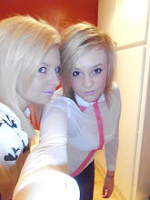
Becky is one of my models for my magazine she has the style I want by the top she's wearing its simple with decoration on it which stands out. She shops at places like top shop, wardrobe and river island which do these type of designs, also she buys things from top man as boys tops look good on girls to. She wears neutral colours also like a magazine this top is black on white which is used a lot in fashion as well as other day to day use.
Alex is another model for my magazine as she also has a style I like and will work with the magazine im doing. She shops mainly at top shop and likes top man to as she likes the boys jumpers from there which girls wear a lot. In this picture I like the top she's wear as its got a neutral picture on a black background which stands out really well as well it has writing at the top of the top and I like the font used. Becky's and Alex's styles are quite similar as they shop at the same places and like the sort of clothing but they work better in different clothes so ill make sure they wear the right colours with there complexion and the lightness looks right as well. 

Moodboard

My moodboard of things that have inspired me and what kind of things im going to use on my actual magazine. All the styles on my moodboard are quite similiar and i know something about every picture shown on this page.

Fonts

Dreamers
Dreamers
Dreamers
Dreamers
Dreamers
Dreamers
Dreamers
Dreamers
Dreamers
Dreamers
Dreamers

Here are a few fonts that i found that i like the look of and think they will work well with my design im doing for my magazine. Some fonts are bigger than other which stand out more to me, i dont like neat fonts as they look boring and they are the kind of fonts you use for the main text on the page were they shown in columns. The title of my magazine has to be able to stand out to the reader and crab peoples attention so i think going for a big font works well and one were the letters jump out at you as there not straight on the page which wont work with my style either. I want to link my title font with the artist to so its shows im using inspirartion on my magazine from them and the teacher can understand what style of mucis im going for by looking at the title as well.

Colour Palettes

Theses are a few colours i have selected that most stand out to me that will go with the magazine style im doing. There all netruial colours and light so i can do many different effects on them in te light which gives me many ideas of what to do. These colours link to the artists i have chosen by the colours they wear on there album covers and the sort of style they have. The clothes i have chosen for my models use these colours and work well with the people im using as they need to be able to contast together or it wont look good on my magazine cover. Ill also use these colours for my background of my cover but pick out the best colour that makes the models stand out more as there the main feature, as well as making sure the text stands out so the readers can see it and understand what there reading.

Wednesday, 18 January 2012

Other Artists


These are a few videos of the type of music style im doing and what they wear which ill be using in my magazine. They are shown to wear plain tops with hoddies and the videos are very simple no special effects are really used. The artists iv chosen in these videos all sing and rap which shows there multi talented and it works well with the sort of vioce they have and also fits in with there fashion statments they make. There music is about every day life and they show this in there videos by setting the scene and some times using there imagenation in there own vidoes which can relate to the audience that watch and listen them.

Magazine name

Dreamers
Trouble makers
The city
This
Home wrecker
Prophet
Drunk
This is a brainstorm of a few ideas I have for the name of my magazine. I’ve used the kind of words that best describe the music I’m doing and trying to represent my artists that I’ve chosen. These are songs off of Rizzle Kicks and Ed Sheerans album that stand out to me and will best fit my magazine style. My favourites from the list are ‘DREAMERS’ which reminds me that you can dream and one day things just fall into place like its meant to be which reminds me of how Rizzle Kicks became famous and ‘THE CITY’ reminds me how Ed Sheeran lived in London and performed a lot so people would here his music and how he gave up everything to live in the city on a sofa. I’m not quite sure yet which one I’m going to use.

Anaylsis NME Magazine

NME anaylsis

Anaylsis Dazed Magazine

Dazed Anaylsis

Anaylsis ID Magazine

ID Anaylsis

Monday, 16 January 2012

Clothing

These are a few clothes i have seen that remind me of the artists i have talked about and the kind of clothing ill be using in my magazine. They are all quite similar and are very simple, as well as a big part of fashion at the moment for boys and girls. Ill be using girls as my models and they will be wearing similar things to this clothing line iv chose. A lot of girls wear boys clothes these days as it works well on them and genders in clothing are merging together, shown in what people wear every day. The colours all blend as these are the most popular types of colour woren by male and females but ill be using brighter colours that will stand out more but will be nutrial colours that will fit in with the theme im doing and also work well with the place im setting up my photo shot.


My Response On The Teachers Comments

I have used your advice about the magazine NME and it has some very good images of the sort of magazine im wanting to do as well as the type of music they play. Iv also used a few others you told me to look at but i think NME works best with the music magazine im doing, which ill show on my anaylsis of the magazines im doing now.
The easy parts of achieving the look im going for is that the clothes the artists are wearing that iv shown you are the clothes i have in my own wardrobe and they work well with the people im using on the cover as they also wear this sort of clothes. The difficult part is getting the right lighting and colour to go with the style i want and making sure my models work well with the theme of my magazine, might have to change a few colours around and use a few brighter and colourful colours.

Thursday, 12 January 2012

Image & Fashion

These are a few fashion images i like off of 'look book' which link to the artists i have chosen and the sort of image im wanting on my magazine cover. These clothes are simple and a new geek cheque that is very popular in many shops and a big seller to teenagers.

I like the image of the boy he looks stylish but in a simple and geeky kind way which will get a big audience. The colours used are nutrial and work well with the setting he is in as well as the clothes colours blending it to the background and you work out what time of year it is, Aurtum.  The girl is also wearing the same style as the lad and it applies to me as well as other teenagers, she is shown in a stereo typical london setting which works with the clothes she's wearing as there smark but casual and work with the setting she's been put in. Many artist are wearing this style which inspirers other people to wear it. 
I like the black and white used in the clothing choice as i wear lots of these colours. I like the design shown on the top which shows the persons own style by having pictures on the top. I like the bright pink top she is wearing it really stands out but im going for more of a plain natural colours that work with the theme they are set in, which these two outfits don't do. The girl wearing the pink top works well with the back ground as it shadows the bottom of the page and shows off the top more and her pink hair which matches with the top showing a statement of her style.
This influences me by letting me know the colours that work well with the person I use and is shot with a theme that connects it all together.

My favourite Artists

One of my biggest inspirerations to music are Rizzle Kicks, they were founded in 1996 and started playing together round Rizzle's auntie's house. It wasn't until eight years later that the pair reunited after both moving to Brighton and facing each other head-on in a Sunday league football match. Then four years later they went to the same college and soon realised how nicely their styles fitted together in the music indursty. As a newly formed duo, they started to hustle for beats from local producers and started making their own music videos with a friend of theirs. Getting into a proper studio with some talented producers, they made their album (stereo typical) a mixture of pop and hip hop incorporating the fun elements of the old school hip-hop era circa 1988-92.
This is their album cover for stereo typical, i like the colours they use as there simple and how there faded to different colours which blend into each other work very well. They are shown in normal clothing (nothing fancy) there facial expressions are plain which is clever as you cant read anything about them. I love the cover as it symbolies them as people and they dont try and stand out with bright colours, they show there true selfs and what there all about which is there music. By doing a cover like this they have there true fans buying there CD not just people who think the covers pretty so they buy it for that reason which a lot of people do. They use a few techniques I have put on my cover junkie strip which inspirers me.
This picture is similar to there album cover as they use the same colours which work well with there style. The light used in the picture is shown in the middle through the window and lights up there backs and shadow their faces. There facial expressions are always shown in the same way like they didnt even notice they were having there picture taken but it works well with there complex. These colours are nurtail colours that are lighter in the background and darker in there face to make them stand out from the picture. It is a staright on shot to get the background on as well as there faces which are the main point of the photo.
In this picture its more posed and they use simple facial expressions as normal which they use in all there pictures. The background is white which makes there clothes and the equiment they use stand out more as they use simple colours. This shot is straight on and they get the unbrella in as its the main point of the photo as well as them. The clothes they wear are normal teenagers clothes and they have there own style and dont try to dress up they keep it arriganal and simple as thats part of there music style. How they look is shown in the songs they sing like being laid back and relaxed. They work well with the camera.

Another artist that inspirers me and is close to Rizzle Kicks is Ed Sheeranis, he is a singer/songwriter. He learnt the guitar at a very young age, and began writing songs at High School. His style of music is Folk rock, acoustic, hip-hop, grime. He did 312 gigs, James Morrison had done 200 gigs in a year, so Ed said he wanted to beat him on this number which he did. He ran out of money and left his flat he was renting and started ‘sofa surfing’ around London, he has been doing this ever since, even after he signed his deal. He released his song You Need Me, just before going on tour with Just Jack and began to get noticed after he posted a video through SB.TV, which led to mainstream rapper Example asking Sheeran to tour with him. He reasled his debut single called The A Team which is a big selller now and he has a big fan base.
This is Ed Sheerans debut album cover for The A Team, i like how he used only one colour for the whole cover. It is clever as he has ginger hair and he makes it blend in with the orange colour he use over the cover, his face also works well with the colour and makes his features stand out. His face is a natural pose which doesnt give much away. They make his face fussy on the out sides of his face so it slowly goes into the background and his face isnt smoothe like normal they have made his face look hard and by his eyes he looks serious. This is quite simple to the eye and nothing fancy again, it shows him and what his about.
I love this picture as it works well with his style and they use the origanal colour white on black. In many of his videos he isnt shown as the main character as he uses other actors to be him but he will show up at some point in the video just for the fans to have a sneak peak of him and this picture explains that very well. The black and grey works well together and works well with his features he is shown in dark colours in this and the cat in lighter colours showing the cat being the main point and him hiding behind it. This is a straight on shot.
In this picture they use natural colours like Rizzle Kicks do and make his clothing darker and the background lighter so he blends into the wall. He also wearing day to day clothes nothing fancy and picked out by stylists he has his own style and makes peoeple work around him. A lot of his videos explain him and what his like as well as pictures, he doesnt like to pose he just smiles and works well with the camera.
These are my two favourite artists and they will be inspirering me with my magazine covers.

Tuesday, 10 January 2012

Inspiration

These are a few magazine covers around the class room which iv looked at and have gave me some ideas on how to do mine. A lot of them use black on white background which is one of the most used techniques used in media like posters, magazines and newspapers this inspires me on my type of cover im wanting to do.

The ones that stand out to me are the simple ones with white backgrounds and black text and a big picture of the celebrity they use as they not trying to be fancy and trying to hard to impress, they go for the readers that enjoy the magazine for the name not the cover. The ones with bright colours and lots of information every where on the page looks messy and does not inspirer me because it does'nt fit in with the style im going for, for my magazine cover.
This is one of the designs i don't really like as it isn't very interesting and it's shown to be quite plain and boring, which doesn't catch the eye of the reader. Its simple and uses dule colours which are part of my design but it does'nt stand out. It reminds me of space and isnt what this cover is trying to get at, so tells you a whole other story.

Monday, 9 January 2012

Cover Junkie, Which Inspirers Me

This is my first blog since iv been back at school and im showing a few front pages from cover junkie that inspirer me to make my magazine and the likes and dislikes i have on each cover.

I love the colour of the background and how they have put a simple but eye catching picture of the lips in the middle of the page with a bold black heading. Might need a bit more information to explain the magazine.
I love how they use normal text and then use graffiti font over the top of the magazines name to show how society is, there rebellious. Its simple but it works well with the magazine. The background colour wouldn't be my first choice.
I like this as it is very simple and attracts the male and female eye which is very clever. It has little information which doesnt tell you what the magazine is about but it uses the black on white technique which is one of the biggest techniques use for magazine covers.
I like the cover to this as they use a indie boy on the front which draws attention and by useing the fraise "sucks to be us" which is a very teen thing to say and gets the readers interested. The colours are simple and work well together, some text are small which shows whats more important to read about.
I like how simple this is and how they use typed out words from the computer as there front cover makes it look easy to make, it also describes the magazine well. It doesn't have a picture which id like to have one mine.
This applies to me as iv seen it around a lot, its used for posters for new up coming singers and different events occasions too. The colours are simple and work well if I could change anything id put a picture on to make it look more dramatic and eye catching.
I love the colours used on this cover and the way the girls body is positioned, with her hands below her face being the main feature on the page as well as her eyes that stand out. The text font used is classy and there's not to much of it. The heading is eye catching which is simple.
I love the way they shadow out half of there faces and bring out the colour in the side you can see. The colours they use go well together and use a black on white background technique. The fonts they use are simple and stand out to me.
I like how simple the cover looks and using black on white works well with the featured star on the front. I like the angle of the picture showing his face and top mid shot. The heading is bold and stands out on the page  letting you know the name of the magazine.
This is clever as it blurs out all the other text to show you the main point the magazine is getting across. Its simple but gets your attention. I don't like how there's no information on the front that you can understand which can tell you what's in the magazine or a picture.
This saying is one of the most famous saying in the world and crabs a lot of peoples attention. I like the colours used for the magazine and how they've laid it out. The only thing im not keen on is the red as I like natural colours which are simple.
I love how they use a famous face for the cover of the magazine and show it as putting a puzzle together to see who it is, it is a very interesting technique. I like the colours used and how he's shown to have a straight face. The information on the page tells you who it is but not much about what's inside.